Previously, Lead Product Designer at Young Platform, where I shaped the experience across web and mobile and built its first design team as the exchange grew to over 2 million users.
For over 8 years, I’ve focused on making complex products feel clear and intuitive. I combine strategic thinking with a strong eye for well-crafted, functional interfaces, helping shape early ideas into polished experiences used at scale.
Outside work, I’m usually on the move, out for a run, at the gym, or travelling somewhere new. I love wandering through contemporary art museums, and I nearly always have a book or podcast on the go. A good conversation can take me from design and products to finance and investing.
World ChatBuilding World App’s messaging experience from 0→1
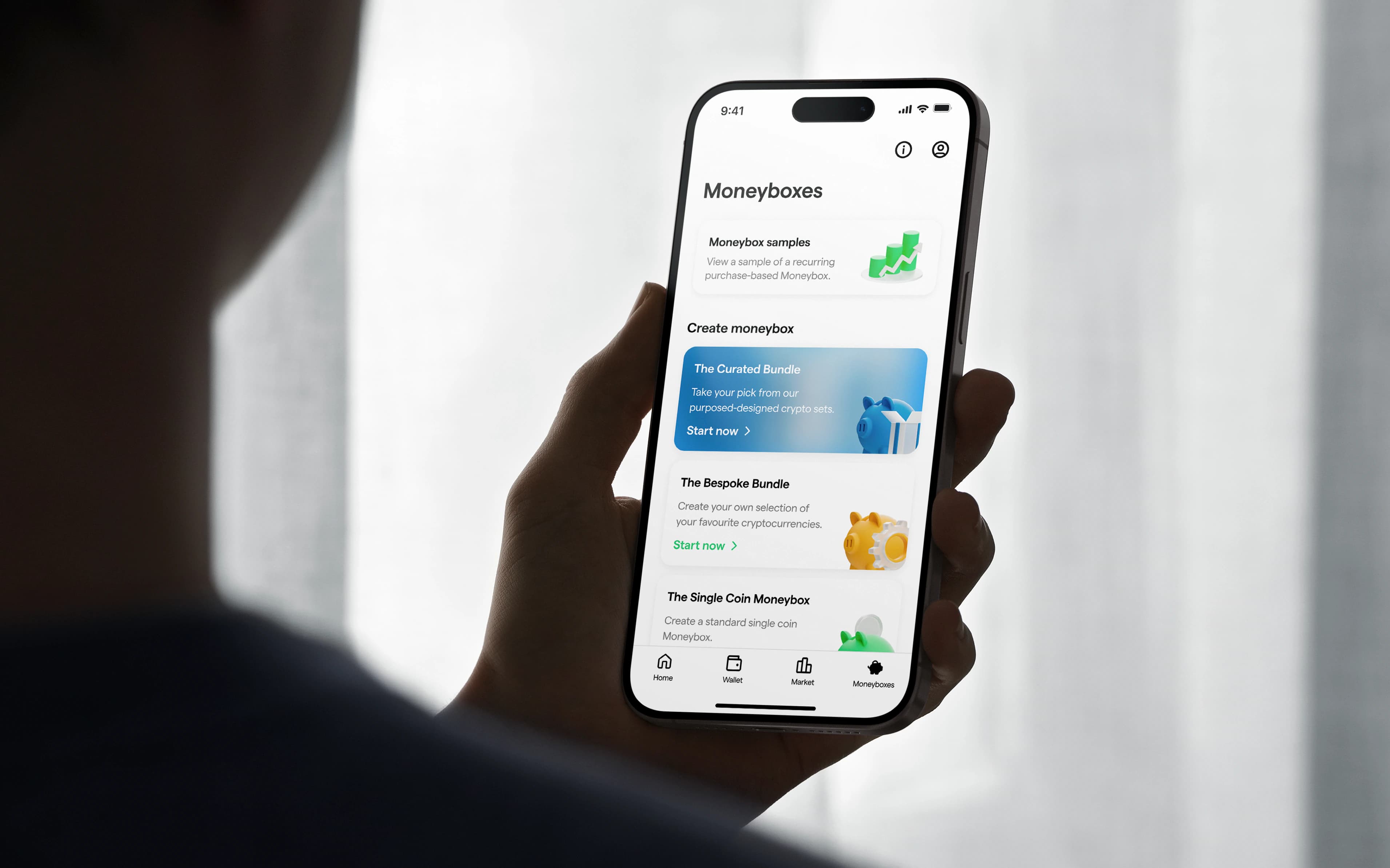
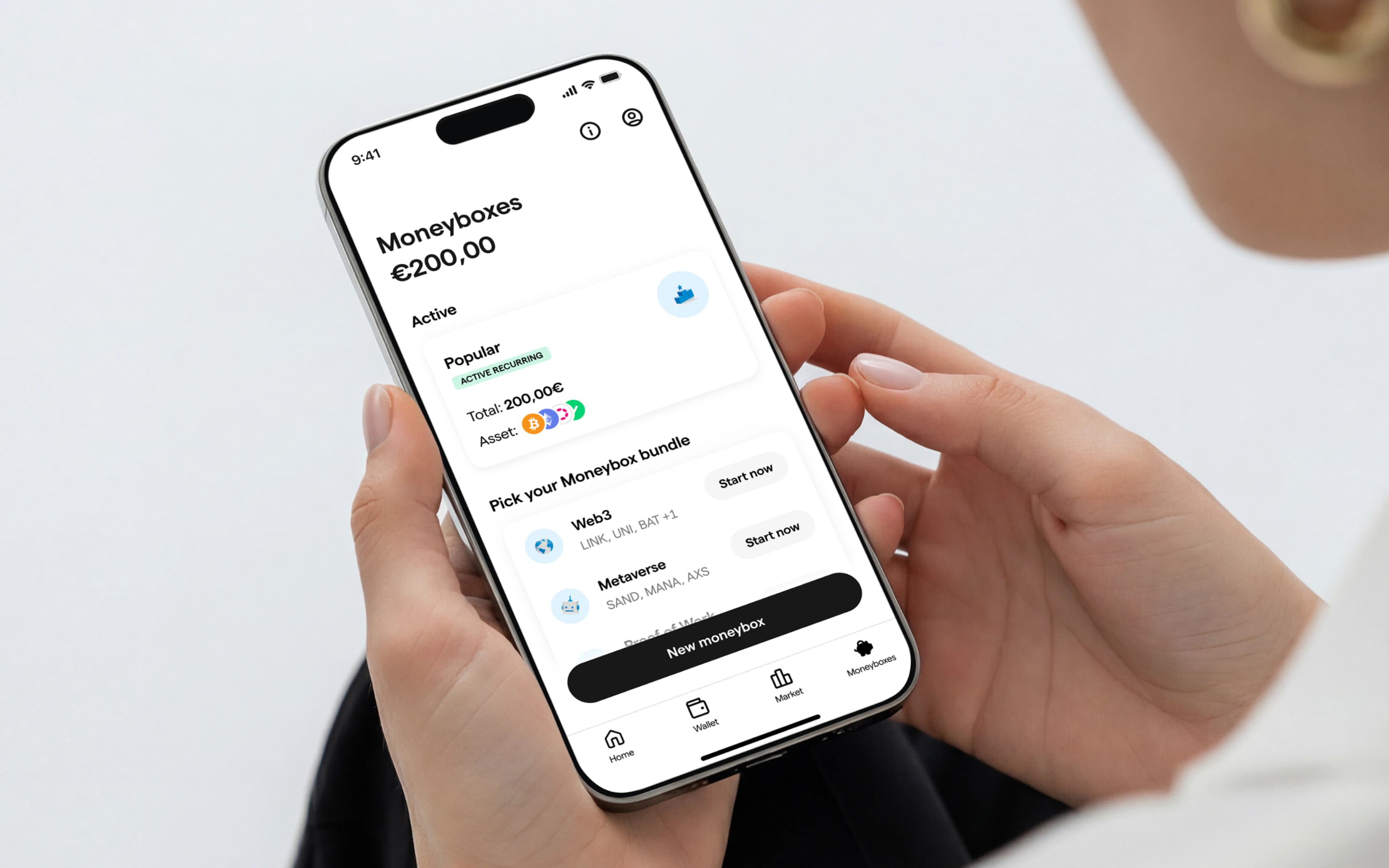
Moneyboxes is a recurring investment product designed for Young Platform, an Italian crypto exchange focused on making digital assets accessible to everyone. Rather than optimizing a single purchase, we redesigned the experience around long-term investing, helping users build confidence through automation, guidance, and flexible investment strategies.
Company
Young Platform
Role
Lead Product Designer
Services
UX/UI, Prototyping, Visual Design, Strategy
Team
Me, 4 Engineers, 1 PM
Year
2024 Q4 - 2025 Q1
From one-shot buys
to smart accumulation
Young Platform's audience wasn't made up of professional traders. Most users were approaching crypto for the first time, but existing investment products assumed a level of confidence and knowledge they simply didn't have.
Research revealed a clear opportunity: shift the experience from one-off purchases to a product that encourages gradual wealth accumulation through recurring investing.
My role
I co-led the design of Moneyboxes alongside another Product Designer, partnering with cross-functional teams throughout the project. My primary focus was defining and maintaining a consistent product experience, aligning new features with the existing design language while evolving the platform.
From intimidation
to intuition
One insight became clear during research: there wasn't a single type of investor.
Some users wanted guidance, others wanted complete control, while many simply wanted the quickest way to automate recurring purchases of a single cryptocurrency.
The challenge wasn't designing another investment flow, it was designing a product flexible enough to support different behaviours without increasing complexity.
Designing different
ways to start investing
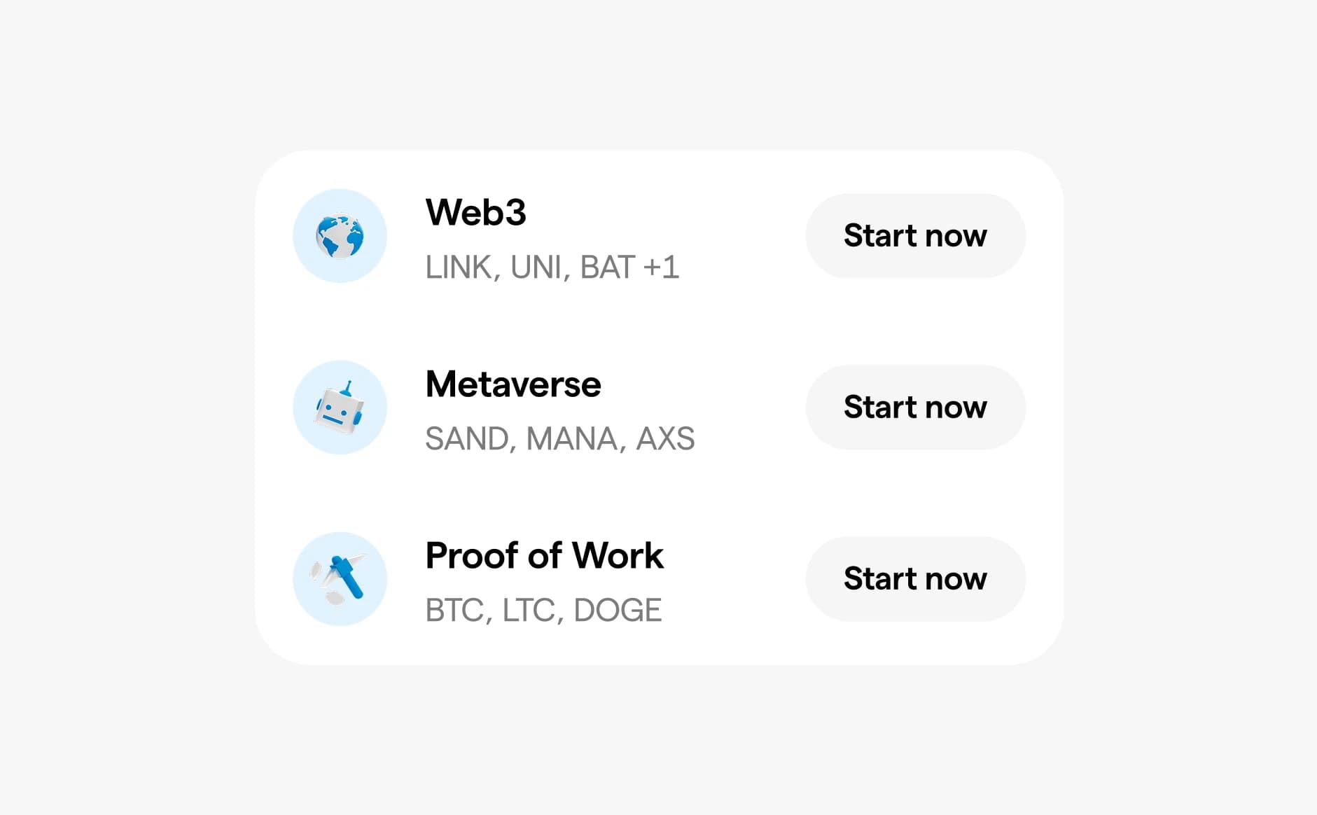
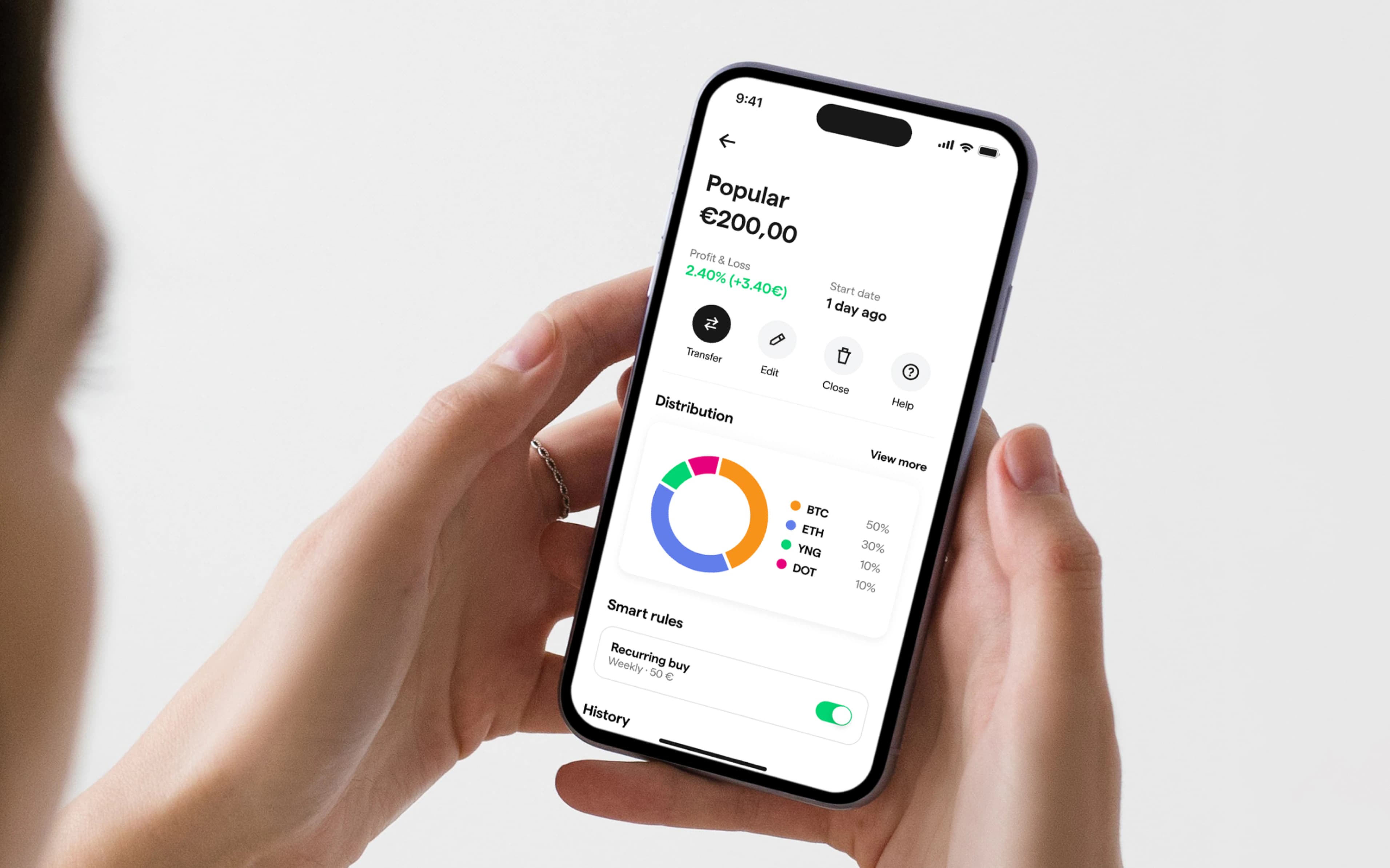
Instead of designing one experience that tried to satisfy everyone, we created three complementary Moneyboxes. Each one supported a different level of confidence while encouraging the same long-term investing behaviour.
The curated bundle
A guided portfolio designed for people taking their first steps into crypto. Curated asset selections removed decision fatigue and made getting started effortless.
The bespoke bundle
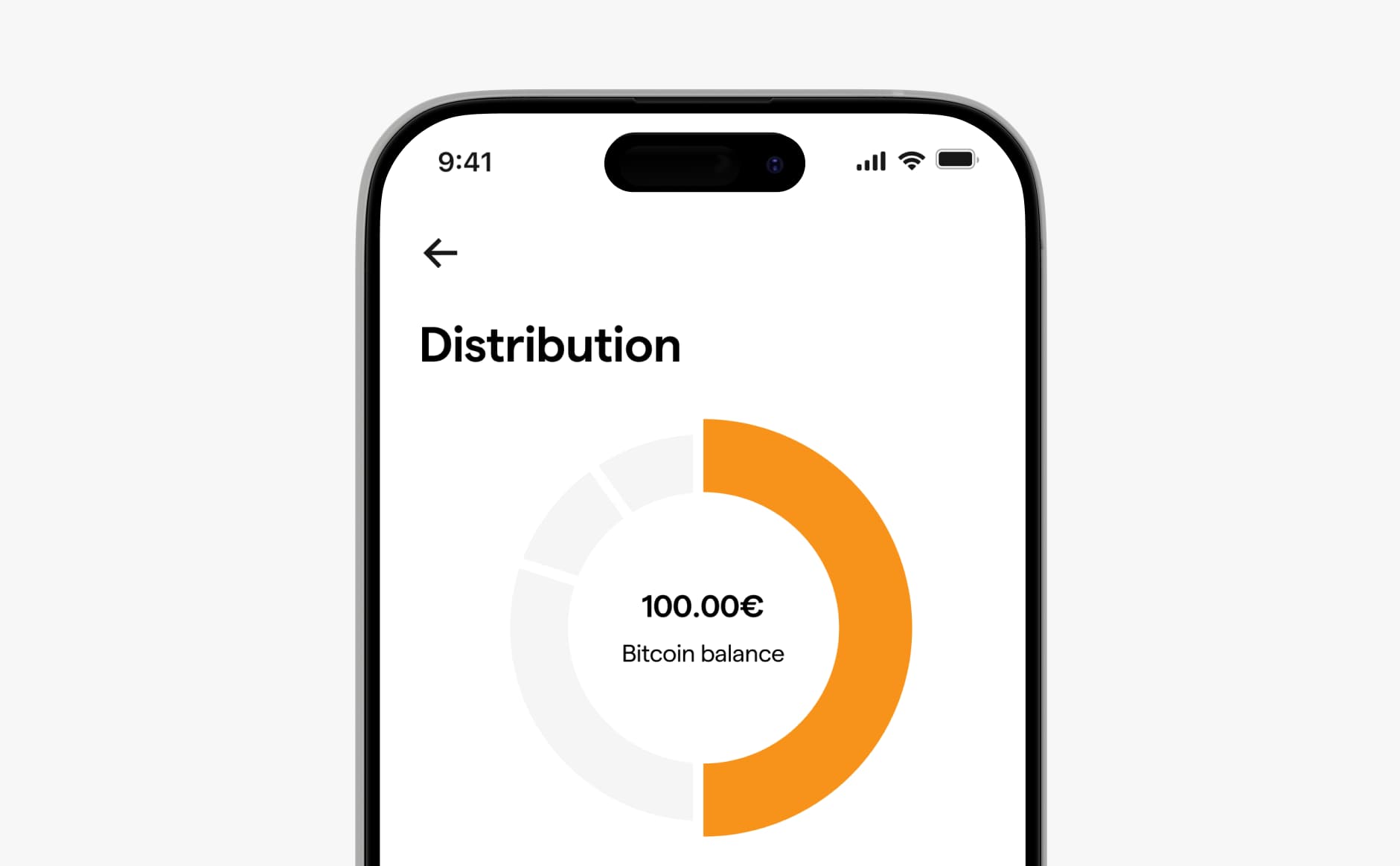
Built for users who wanted more control. It allowed them to create a personalised portfolio while keeping the simplicity of recurring investing.
The single coin moneybox
A streamlined experience for users with a specific cryptocurrency in mind, reducing friction for the most common investment scenario.
From launch adoption
to repeated interaction
After launching, the redesign delivered clear improvements across engagement and diversification metrics within four weeks:
Increase in active users
0%+
Increase in active users
Increase in recurring transactions
0%+
Increase in recurring transactions
Growth in diversified portfolios
0%
Growth in diversified portfolios
Summary
What stayed with me from Moneyboxes is that simplicity doesn’t always mean giving everyone the same experience. At first, the instinct was to reduce complexity as much as possible. But the more we worked on the product, the clearer it became that people approached investing very differently: some wanted guidance, some wanted more control, and others already knew exactly what they wanted to buy.
Designing Curated, Custom, and Single Coin helped me see that a product can stay simple while still giving people different levels of control.
That’s probably the biggest lesson I took from the project: good simplification isn’t about removing choice, it’s about revealing the right amount of choice at the right moment.